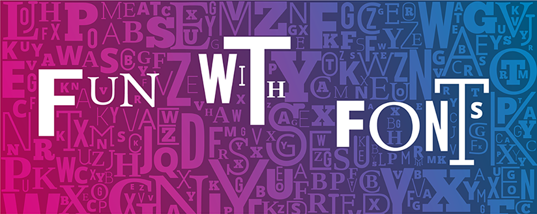
Any designer will tell you how important the right typeface is to a concept. Every option – and there are multiple thousands – carries a distinct “look and feel” and thus conveys a certain meaning, even if we’re not conscious of it. You may have heard of the classic example of these two signs:
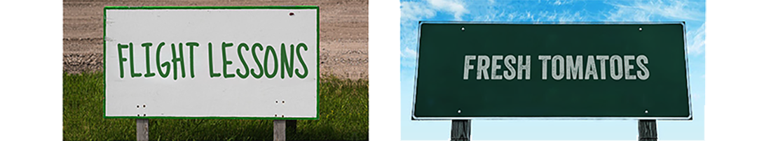
The tomatoes don’t seem like they’d be very good. And neither are the chances of a safe landing when it comes to the other sign. But what if you reversed the fonts?

Suddenly, what’s on offer in both cases seems more authentic. You feel trust.
So let’s have a little fun. See if you can pair each example to the typeface that’s a better match for the message. Answers are at the bottom of the email.
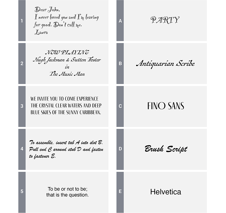
Answer key: 1B, 2A, 3D, 4E, 5C